
You want to be published? You want to have a career as a writer? Here are a few things to keep in mind when you’re building your website. Because you NEED a website. And your website should show you’re a professional–even if you’re a goofy one.
INFORMATION:
YOU – A biography. On my site I have a brief bio on the front page, and a more in-depth one later on. You need an author photo that wasn’t taken by your child or by your phone held at arm’s length. Professionalism counts.
YOUR BOOKS – What they are and where to find them. I like to have one page with everything, and then individual pages for each novel so I can talk about inspiration or share bits of trade reviews – I LOVE it when other authors do this. If you write in different genres, separating by genres is smart. And just like a resume, put the most recent up first – you may argue w/ me if you’re writing a series, but otherwise? Most recent book gets top billing.
EVENTS OR APPEARANCES – Even release dates, or cover release dates… Sometimes it’s more about making yourself LOOK busy and/or important. Yes, I just said that. I’ve seen authors write up things like – attending launch party for XXX, which is promo for the both of you – WIN-WIN)
LINKS TO SOCIAL MEDIA – You don’t have to take on the whole world in social media. Choose what works for you and keep your audience in mind (Yes, this could be a post on its own. Maybe several).
LINKS TO BLOG – If you blog, if you group blog…
AN OFFER TO SIGN UP FOR A NEWSLETTER – If you have one. The pros and cons of this would be much better discussed by someone other than myself 😉
THE FEEL OF THE SITE:
You’re selling YOU. You need to have a website that reflects both you and what you write. Your website could/should follow the feel of your stories, but as more people branch out into more genres, the more important it is to have a website that encompasses YOU, and second, what you write.
A few examples:
I wanted to show Lindsey Leavitt’s site because she writes in several genres. Now, if she wanted to build a site specifically for a series, awesome! She can link to it from the site that is about HER.

Her tagline, right at the top, tells you what you’re in for. Social media is easy to find, and her tabs help readers of different genres find what they’re looking for. The colors are bright and fun, and match the tone of her book covers. www.lindseyleavitt.com Just under her header – fab white space (I’ll show examples later on).
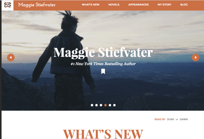
Maggie Stiefvater’s website is also fab. Her novels/series are all quite different, so her website is neutral. Want more info on a series? She has links for that. The rotating headers all involve MAGGIE and things she likes as a person rather than as an author. Just under the lovely headers is very simple with lots of white space.
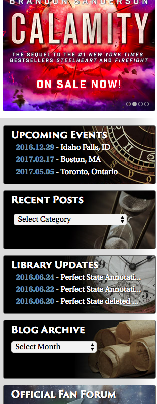
OK. We’re not all Brandon Sanderson, but this is his sidebar:
All of his upcoming events are right on the landing page. No one needs to hunt around on his website to find his fan club or where he’s going to be next.
Simple and brilliant. AND the artwork falls in line with his books without taking over the site.
How beautiful is KATHRYN PURDIE’S SITE??? I know right away what she writes from the background, but it’s so subtle! I love it.
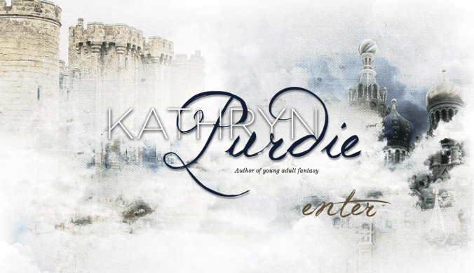
And then it gets even better when you press ENTER:
All her links are interesting, and there’s some great info here without this feeling overwhelming.

And now we’ll talk about – THE WHITESPACE. Cluttered sites are SO hard to navigate. Kathryn Purdie put this subtle background in instead of white space, which I think works SUPER well, but it’s so easy for a website to be so busy that visitors don’t know where to direct their attention.
Veronica Roth’s website does a brilliant job with clean white space:

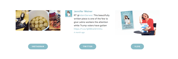
Jennifer Weiner’s site is gorgeous, simple, and you can see how effective white space can be – even at the bottom of her landing page (BELOW):
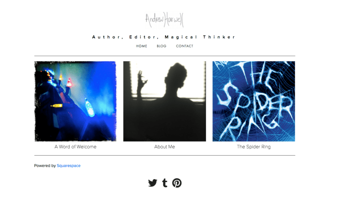
I will readily admit that I’m a sucker for simplicity, but ANDREW HARWELL’S site? Simple & interesting. He wears a lot of different hats, so simple is going to be better.
My best advice to you is this:
Go to a TON of websites of authors you admire. Authors who write what you do. Authors who write something completely different from what you write. Take note of what works. What doesn’t work. And then spend some time thinking about how you can tailor what works, to yourself. You may need to hire a designer. You definitely need more eyes than just your own.
My inspiration for today’s post came from the fact that I really want to re-work my own site. Something I’ll be tweaking over the holiday break 🙂
Happy designing!
~ J0
Jolene Perry has written young adult titles for Entangled/Macmillan, Albert Whitman Teen, and Simon Pulse. She is represented by Jane Dystel of Dystel and Goderich Literary Management. You can find her on her BLOG, her WEBSITE, or chillin’ with her family in Alaska (pun intended).
